


Subject Photo: Merlin Yosef (iNaturalist)
Introduction
The suggested activity is intended for middle- and high-school students and can support individual or group research projects. It can fit within learning about environmental topics such as biodiversity and ecosystems across a range of subjects (science, biology, environmental studies, Shelach [field studies], geography, and more).
Exploring data from professional databases—such as those collected on iNaturalist—gives students an opportunity to learn, analyze, and understand ecological processes, trends, and species distributions at broad scales, using high-quality, diverse, and up-to-date data. Working with databases exposes students to real scientific research methods, spatial pattern analysis (e.g., mapping ecological value, observation density, site comparisons), and the use of advanced tools for data processing, statistics, and information visualization. Moreover, databases provide a broad and reliable foundation that is independent of time, season, or resources, enabling investigations of research questions that are not always accessible in short or one-off fieldwork.
In addition, combining database analysis with students’ own field data develops skills in critical thinking, cross-checking sources, recognizing the limitations and strengths of each method, and a deeper understanding of the scientific research process. Working with databases strengthens the perceived relevance of learning and allows students to be true partners in environmental decision-making, while developing technological, analytical, and social skills—essential tools for the citizens of tomorrow.
There are several ways to use iNaturalist data in the classroom: through analysis of the database itself, and—importantly—by complementing gaps with field observations or data from additional databases. This has great value for understanding local, national, and global biodiversity, grasping interesting phenomena, and exploring selected issues. However, it is important to understand that such analyses also have notable limitations arising from data bias. Teachers and students should be aware of these limitations and address them when drawing conclusions and presenting findings. Knowing these biases does not invalidate the research—it strengthens it! It is both possible and recommended to include discussion of limitations and data quality as part of the learning.
Possible Biases When Analyzing iNaturalist Data
| Possible Bias | Explanation | How to handle / correct |
| 🗺️ Spatial bias | Sampling effort is not uniform—most observations are made in accessible areas: parks, trails, urban zones. | Map observation density and down-weight/omit over- or under-represented areas; initiate targeted sampling in under-reported areas. |
| 🕒 Temporal bias | Sampling effort is not uniform—most observations are during the day, in comfortable seasons, on weekends. | Account for observation time in analyses; compare the same seasons/periods across years; encourage recording in varied seasons/hours. |
| 🌼 Conspicuous-species bias | Colorful, large, or familiar species are reported more than small or cryptic ones. | Compare among species with similar traits; add monitoring methods for “hidden” taxa; focus on higher taxonomic ranks (e.g., all birds rather than a single species). |
| 🧑 Observer bias | Observations depend on the user’s knowledge, interests, and ability to photograph and report. | Check observations by user/ID level; use only “Research Grade” observations where appropriate; cross-reference with other sources. |
| 📱 Technology bias | Observations depend on access to smartphones/internet—e.g., in the Haredi community. | Encourage group observations, especially in under-represented populations; combine data from additional sources. |
| 🐦 Duplicate-reporting bias | The same species is reported repeatedly at the same site, or by several people. | Use analyses with “one occurrence per day/location”; check duplicates by date, location, and species. |
| 🌍 Geographic / social bias | Peripheral regions or certain populations report less. | Map social/regional representation; initiate community projects in underserved or remote areas. |
Choosing Appropriate Research Questions
At the start of any investigation based on iNaturalist data, it is important to define research questions that interest the students and then seek the relevant data within iNaturalist—or outside it—to answer the question. Below are suggested questions grouped into several categories (spatial, seasonal, by biological groups, social-behavioral, and general questions with options to expand). Afterwards you’ll find guidance on how to locate and analyze the data while addressing limitations. Each question follows a fixed template covering four aspects:
❓ Why is this question important?
⚖️ What biases and limitations may affect the investigation?
🔍 How and where can the data be found?
🧠 What to do with the data?
Some questions suggest using advanced analysis tools such as GIS or statistical analyses. Adjust the questions to the students’ abilities.
Spatial Questions
What are the differences in species richness between two different urban parks / areas?
Species richness refers to the number of different species found in an area or habitat. It is a purely quantitative measure. For example, if one forest has 10 tree species and another has 15, the second forest has higher species richness. Species diversity is a broader concept that considers both richness and the relative abundance (evenness) of each species. In other words, it examines not only how many species there are, but also how evenly individuals are distributed among species. In the following questions we refer to species richness.
❓ Why is this question important?
This question encourages learners to examine how different factors influence species richness (e.g., environmental conditions, site management, proximity to water, human disturbance, and more). Students learn that biodiversity is not uniform but varies with site characteristics and interactions. Comparing two areas helps develop skills in data collection and analysis, understanding ecological principles, and informed discussion on sustainable planning and management. It also fosters emotional and civic engagement with nature in our surroundings.
⚖️ What biases and limitations may affect the investigation?
- Area size: iNaturalist makes it hard to compare areas of different size. A workaround is duplicating the page and moving the same-sized shape. If parks differ in size or layout, use a relative measure like species per unit area.
- Sampling bias: If sampling doesn’t cover the whole park (e.g., only along trails or in lit areas), results may be inaccurate.
- Differences in observation times: Observations at different times of day or in different seasons can strongly affect what’s recorded.
- Observer bias: Some species (e.g., colorful butterflies) are identified more easily than others (e.g., small insects or hidden birds).
- Human influences: Visitor numbers, trail length, or recent maintenance/pesticide use in one park but not another can affect results if unrecorded.
- Partial diversity metric: Using only species counts (richness) without considering evenness/dominance can miss part of the picture.
🔍 How and where can the data be found?
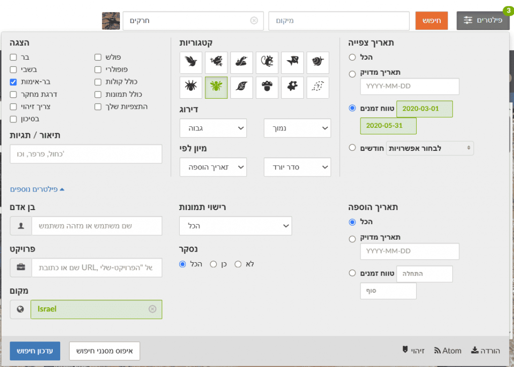
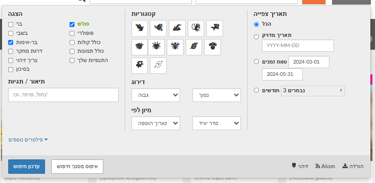
Go to the Explore tab and zoom the map to the park/area of interest. Mark the park with a rectangle or circle. The top bar shows a summary of the number of observations and the number of species within the defined area.
Before moving to the second park/area, duplicate the page you’re on (right-click the tab > Duplicate). In the new page, find the second area and drag the rectangle/circle from the first park to the second. This ensures the same area size is examined at both sites. Drag using the orange handle below the shape.
Note! A rectangle or circle may be limiting: some park observations may fall outside the shape, or the shape may include observations beyond the intended boundaries—i.e., this method cannot perfectly match the chosen area. A more precise option is to import a KML file from Google Maps or a GIS program and define a new Place.
These data reflect all observations collected on the platform from the start to today. You can filter observations by a uniform time period.
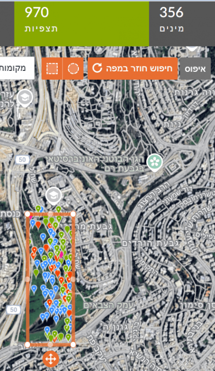
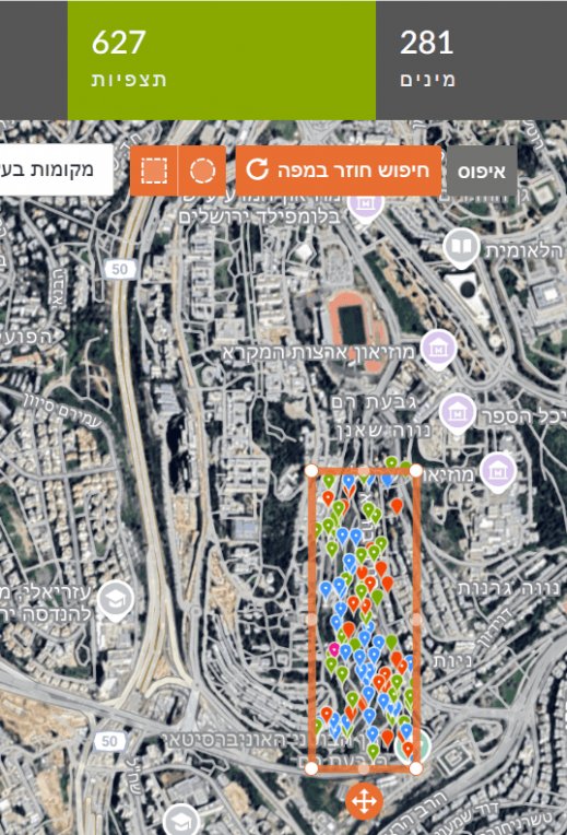
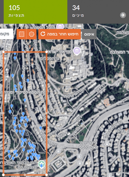
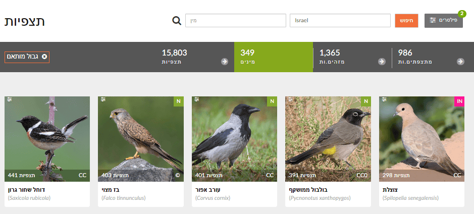
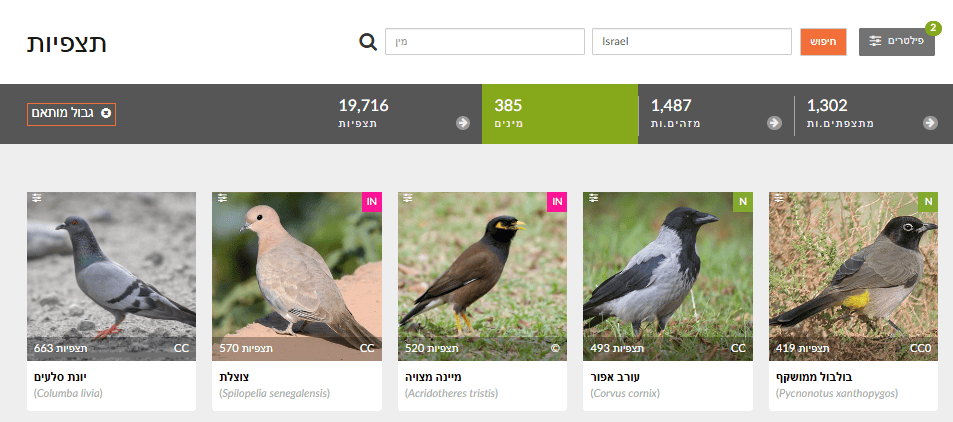
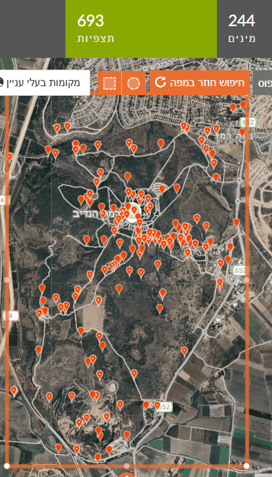
For example: in the right image, a marked area in Gazelle Valley (Jerusalem) contains 970 observations of 356 species. In the left image, the same rectangle dragged to the Jerusalem Botanical Gardens (Givat Ram) contains 627 observations of 281 species. In the same-sized area, more species were found in Gazelle Valley than in the Botanical Gardens.
🧠 What to do with the data?
- Continue exploring follow-up questions (e.g., is there a difference in observations of a specific species between the two areas? Which species are most frequently observed? What factors influence this?).
- Have students build a comparison table or chart for the different parks/areas.
- Ask students to hypothesize which factors influence differences between the parks/areas and propose ways to test these factors.
- Ask students to draw conclusions about conditions affecting diversity and suggest follow-up questions or nature-sensitive planning ideas—what can be improved to increase species richness?
Is there a difference in the number of observations of certain species between two areas?
❓ Why is this question important?
Addressing this question helps students understand which environmental conditions support or suppress particular species, provides information on species distribution, behavior, and environmental adaptation in cities or nature, and can guide thinking about conserving local species or curbing invasive species.
⚖️ What biases and limitations may affect the investigation?
- Geographic bias: If the two areas differ in size, vegetation, noise, or pollution, differences in observation counts may reflect environmental variation.
- Observation time: Season or time-of-day differences can matter—one area may have observations during active periods (e.g., flowering or migration), the other not.
- Observer bias: Familiarity with a species may lead to more reports—even if its actual presence is similar in both areas.
- Detectability: Some species are easy to see (e.g., noisy mynas); others are hidden or nocturnal—so direct comparison by observations alone isn’t always valid.
- Total observation effort: If one area simply has many more observations (more people/time/reports), the comparison is unfair—consider sample size or compute a relative metric, e.g., frequency as a share of all observations in that area (see below).
🔍 How and where can the data be found?
This is a follow-up to the previous question—use the same steps for collecting data for two areas.
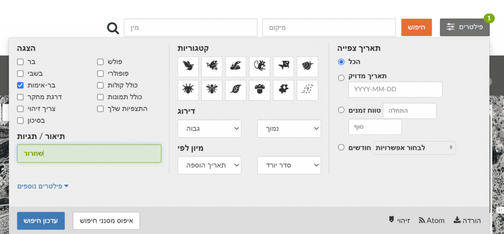
To compare specific species between the areas, filter for the chosen species (Filters > type the species name) and update the search.
For example, Common Blackbird (Turdus merula) has 4 observations in the Botanical Gardens and 9 in Gazelle Valley. Because the counts are small, it is difficult to conclude anything about differences in blackbird frequency between the two areas. In other words, you cannot know if there are truly more blackbirds in one area just from these counts. To check this, compare the percentage of blackbird observations out of all bird observations in each area (similar to the frequency calculation used in the Big Bird Count citizen-science project).
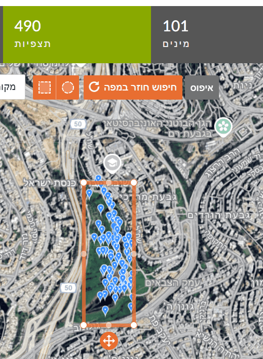
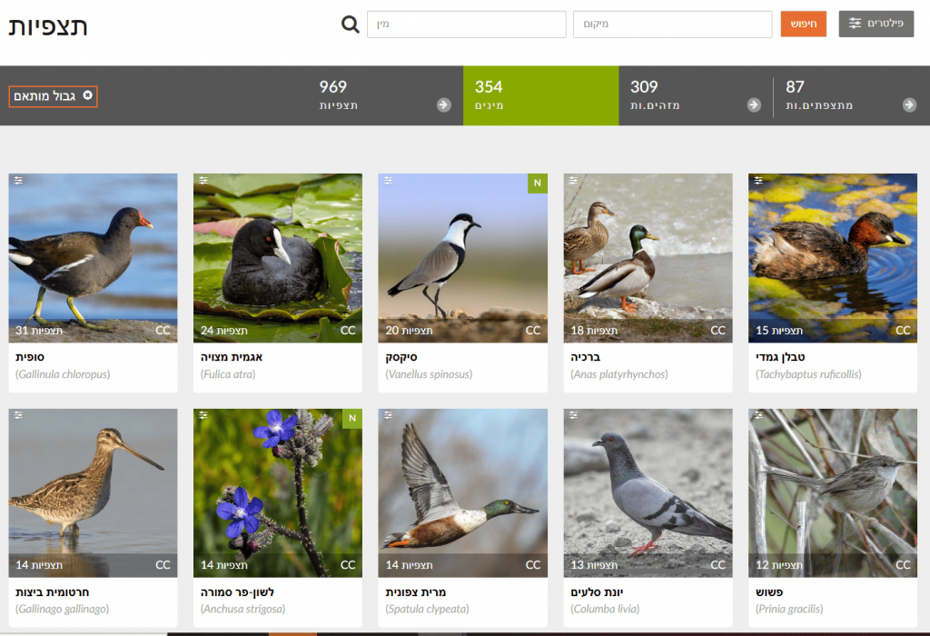
To find the total number of bird observations per area, broaden the search to Birds (click the bird icon). The search yields 34 bird species (105 observations) in the Botanical Gardens versus 101 bird species (490 observations) in Gazelle Valley.
Blackbird frequency in the Botanical Gardens is 4/105×100 = 3.8%. That is, there is a 3.8% chance of seeing a blackbird in the Botanical Gardens. In Gazelle Valley, frequency is 9/490×100 = 1.8%. Thus, the chance of seeing a blackbird is higher in the Botanical Gardens than in Gazelle Valley. Note: a higher percentage in the Botanical Gardens does not necessarily mean more blackbirds there—perhaps fewer other birds were observed, or fewer observations were made in blackbird habitats.
Why are there differences in the number of bird species between same-sized areas? Gazelle Valley may include more habitat types—water features, tall vegetation, relative quiet—so it holds more bird species. But it could also be that more birders visited and reported more species. I.e., higher diversity might reflect sampling effort: more species observed because more observations were made.
Why are there differences in the number of observations between the areas? Perhaps more visitors in Gazelle Valley use binoculars or are bird enthusiasts, so there are more bird observations. A relative metric is species per observation—dividing species count by observations yields 0.3 species/observation at the Botanical Gardens versus 0.2 at Gazelle Valley. The 0.3 vs 0.2 does not prove there are more species in reality. The Botanical Gardens has fewer observations but relatively more species per observation. This can suggest a diverse site, but could also mean too few observations have been made to detect all species.
Additional possible questions to investigate:
- Which species occur in both places? Which are unique to each area?
- Waterbirds vs shrubland birds—in which park is each group seen more? (after assigning birds to habitat types)
- Which species appear only in certain seasons? Does this happen in both areas? (filter by dates)
- Are more species seen in secluded areas or along trails? (map view analysis)
🧠 What to do with the data?
- Data processing: Summarize observation counts of the same species in each area; compare via a table or bar chart.
- Data analysis: Compute a mean or relative metric (e.g., percent of all observations).
- Ask: What might explain the difference? Which conditions matter?
- Action: Have students suggest conservation or management steps based on the findings.
Which species are observed the most?
❓ Why is this question important?
It helps identify which species are most common in each area and, through that, teaches about environmental characteristics, food availability, human activity, and different environmental effects.
⚖️ What biases and limitations may affect the investigation?
Different sampling effort: large, noisy, or familiar species are more likely to be reported than small or hidden ones; season, time, and within-site location also vary.
🔍 How and where can the data be found?
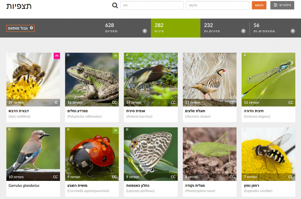
Continuing from previous steps: after drawing a shape for the chosen area, click “Species” to see the most frequently observed taxa—each species shows its number of observations in the selected area. For example, in Gazelle Valley the most frequent observations are of Common Moorhen, Coot, and Spur-winged Lapwing, while in the Botanical Gardens they are Honey Bee, Levant Water Frog, and Chinese Pond Heron. Note: the Chinese Pond Heron is extremely rare in Israel; these likely reflect repeated observations of the same individual in April–May 2021 (Israel Ornithological Center). In short, examine observations in depth before drawing conclusions—open records and check that they span a long period, by different users, and at different sites within the study area.
🧠 What to do with the data?
- Data processing: Build a table per area with species and observation counts; visualize (e.g., bar chart of the top 10 species per area).
- Analysis: Compare between areas: which species are common in both? which are unique?
- Hypotheses: What site factors might explain the results? How can we test them?
Is there a high concentration of observations along certain corridors in a city?
❓ Why is this question important?
It shows whether observations are randomly spread or clustered in favored areas where people report more (e.g., popular parks, trails, accessible zones). You can infer distribution patterns—high concentration may indicate biologically rich areas, but could also reflect high sampling effort. Identifying areas with few observations can highlight the need for additional surveys to get a fuller biodiversity picture. Findings may inform decision-making—areas with many observations might be ecologically valuable and merit attention; conversely, areas with few observations might benefit from interventions to enrich biodiversity.
⚖️ What biases and limitations may affect the investigation?
- Accessibility bias: People report in accessible, familiar places (parks, trails), not in hard-to-reach areas (dense vegetation, private lands).
- Human density bias: High human population density yields more observations even if biodiversity isn’t higher.
- Interest bias: Certain observer groups (e.g., birders) concentrate at certain sites (e.g., ponds).
- Uneven effort: There’s no direct measure of search time per point.
🔍 How and where can the data be found?
In iNaturalist, Explore a specific geographic area (e.g., a city). Choose the place if listed (if not, see instructions for adding a new Place) or draw a rectangle/circle on the map. Choose Map view to see the spatial distribution and clustering of observations.
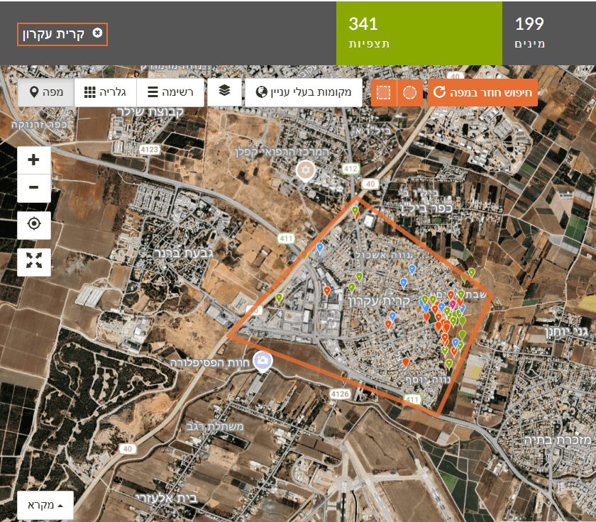
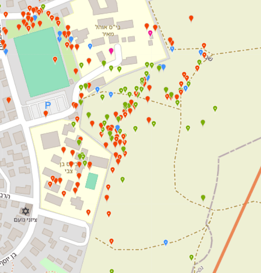
For example, in the left map (Figure 1) we select Kiryat Ekron. At first glance, most observations appear along the town’s eastern edge bordering agricultural fields. Looking closer (Figure 2), most observations were made near two schools, by one observer, i.e., a concentrated educational activity reported by a Green Step instructor. Most observations were along walking paths. This clearly shows a data bias that hampers answering the question.
For example, in the left map we select Kiryat Ekron. At first glance, most observations appear along the town’s eastern edge bordering agricultural fields. Looking closer (Figure 2), most observations were made near two schools, by one observer, i.e., a concentrated educational activity reported by a Green Step instructor. Most observations were along walking paths. This clearly shows a data bias that hampers answering the question. Note: You can choose different basemaps—satellite imagery, street map, or OpenStreetMap.
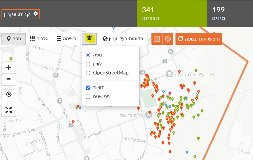
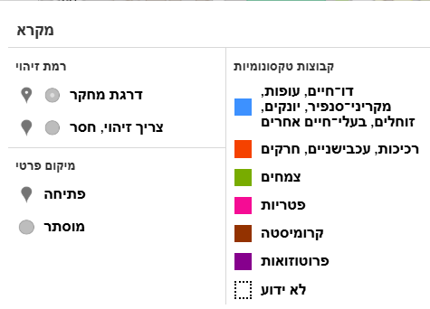
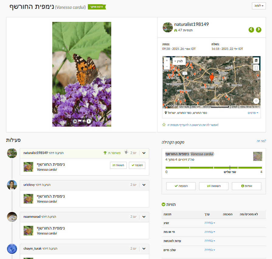
At the bottom of the map is a legend describing observation types. You can distinguish Research Grade observations (dot inside the circle) from Needs ID / casual (no dot), and differentiate taxonomic groups by point color.
For deeper analysis, export CSV data (via the Data or Download tab after filtering).
בתחתית המפה מופיע מקרא המתאר את סוגי התצפיות על המפה. ניתן להבחין בין תצפיות בעלות דרגת מחקר (עם נקודה בתוך העיגול) לתצפיות שצריכות זיהוי או חסרות (ללא נקודה). ניתן להבחין בין קבוצות טקסונומיות שונות לפי צבע הנקודה.
For deeper analysis, export CSV data (via the Data or Download tab after filtering).
🧠 What to do with the data?
- Statistical (density): Compute observation density per unit area (e.g., observations/km²) across city zones—suited for geography students using QGIS (free GIS) or Google Earth Engine.
- Comparison: Compare densities across areas (parks vs residential, main arteries vs side streets).
- Conclusions: Are there “hotspots” of observations? Do they correspond to ecologically valuable areas, or just to human accessibility?
Seasonal Questions
In what period of the year do certain butterflies first appear—for example Painted Lady?
❓ Why is this question important?
Studying timing of species appearance (phenology) helps understand life cycles and links to seasonal changes in temperature, precipitation, and day length. Shifts in timing can indicate climate-change effects on species. It also reveals interactions: butterfly emergence is tied to flowering periods of host plants, or to availability of hosts for larvae.
⚖️ What biases and limitations may affect the investigation?
- ID bias: Misidentification can distort data.
- Human bias: If observers are more active in a certain season, it can create an illusion of earlier/later appearance.
- Date accuracy: Inaccurate dates can affect conclusions.
- Detectability: Large, conspicuous adults are easier to detect than larvae or eggs.
🔍 How and where can the data be found?
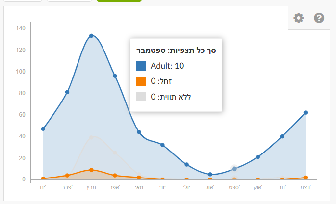
In Explore, enter the species name “Painted Lady” (or another species) in the taxon search. Don’t forget to set the place (country or specific region), otherwise results will be global. Click the species name to go to the species page. There you’ll find a graph showing number of observations by month. This is an average summary of observations over the last ten years. The graph shows Painted Lady is present year-round in Israel, with a marked peak in March during northward migration.
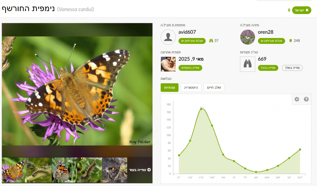
In the History tab you can filter by specific years to examine changes. The figure shows that in recent years—particularly 2019, 2023, 2024, 2025—there was a significant increase in March reports. In March 2019, about one billion butterflies passed through Israel following an especially rainy winter in Arabian deserts, which led to lush growth and abundant food for larvae. Most migrants passing through Israel originate in the Arabian Peninsula and southern Africa and continue to Cyprus and Europe.
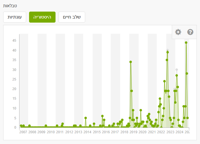
You can also filter by life stage—blue for adults, orange for larvae, gray for unspecified.
Want to contribute and help? You can go over observations and, based on the photos, add annotations for life stage. This reduces the number of unlabelled records. Annotations can be set at the bottom of an observation (visible when logged in): sex, alive/dead, evidence of presence, life stage.
🧠 What to do with the data?
- Draw conclusions from the monthly graph—sharp increases indicate timing of appearance.
- In filters or after exporting to Excel, find the first appearance date each year; compare across years to detect changes in timing.
Seek relationships with environmental factors if climate data (temperature, precipitation) are available—e.g., correlate appearance dates with yearly conditions (use Israel Meteorological Service data).
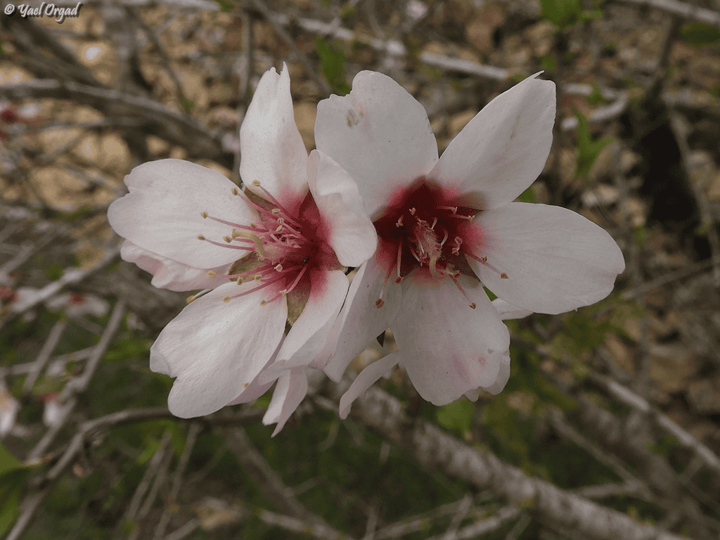
Does the timing of flowering for a given plant change year to year (e.g., almond blossom)?
❓ Why is this question important?
Changes in flowering time are sensitive indicators of climate change (temperature and rainfall). Flowering is a critical life-cycle stage affecting pollinators, herbivores, and reproduction; understanding shifts contributes to ecological insight. Flowering time also matters to agriculture and can help forecast yields.
⚖️ What biases and limitations may affect the investigation?
- ID bias: Misidentifying the plant or its flowering stage.
- Human bias: Focused interest in certain blossoms can affect reporting frequency.
- Definition of “flowering”: Is it first flower, peak, or end? Set a consistent criterion.
- Sample size: With few observations in some years, conclusions are uncertain.
🔍 How and where can the data be found?
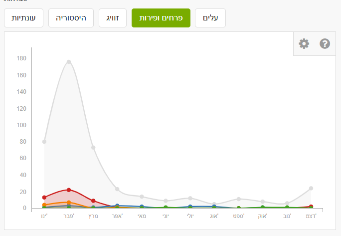
In Explore, enter the species name “Almond” (or another species) and set the place (country/region). On the species page, you can filter by annotations: leaves and flowers & fruits. Note that detailed annotations are not always present. For almond, many observations are gray (no phenology annotation). We may assume many reports are during flowering with a peak in February, but you can verify via the photos.
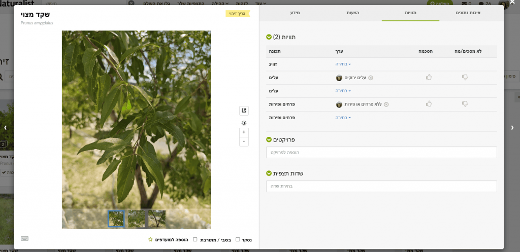
Want to contribute and help? Want to contribute? You can add annotations observation-by-observation. To batch-review: in Filters set the species (Almond), location (Israel), and click Identify. A window opens where you can flip through photos easily. In Info you can confirm IDs if you agree it’s almond. In Annotations choose the appropriate state for leaves (no live leaves / breaking leaf buds / green leaves / colored leaves) and for flowers & fruits (no flowers & fruits / flower buds / fruits or seeds / flowers).
As with butterflies, check the monthly graph and/or download data to Excel and filter by year.
🧠 What to do with the data?
- For each year, find the earliest confirmed flowering date. Build a graph of first (or peak) flowering over years. Check for trends: is flowering advancing or delaying?
- Compare findings to climate data (temperature/precipitation) for those years; test correlation (Israel Meteorological Service).
Are there more insect observations in summer than in spring?
❓ Why is this question important?
This type of question helps understand seasonal activity patterns. Many insects are more active in certain seasons due to temperature, humidity, and food availability. Understanding seasonal activity aids in assessing biodiversity at different times. Shifts in seasonal peaks can indicate climate-change effects.
⚖️ What biases and limitations may affect the investigation?
- Human bias: If people spend more time outdoors in spring, observation counts may be artificially higher.
- Detectability: Some insects are more conspicuous in particular seasons (e.g., butterflies in summer).
- ID bias: Misidentification of insects or groups.
- Season definitions: Define “spring” and “summer” consistently (e.g., March–May vs June–August).
🔍 How and where can the data be found?
In Explore, set Filters to Insecta and choose a specific place (e.g., Israel). Select a time range for a chosen year and season (e.g., spring 2020). After updating, suppose you find 2,067 observations of 669 species. Change to summer of the same year: 1,485 observations of 530 species. Repeat for additional years and compile a table.
🧠 What to do with the data?
- Examine the table and compare counts to see if there are clear differences. Create a bar chart of observations per season, per year.
- For older students, perform a simple t-test* (if assumptions hold) to test statistical significance of spring vs summer differences across years (provide Excel instructions).
- Explain results based on biology (insect life cycles, optimal temperatures, etc.).
* A t-test compares the means of two groups to assess whether differences are statistically significant (unlikely due to chance). If p-value < 0.05 (commonly used), the difference is considered statistically significant.
Questions by Biological Groups
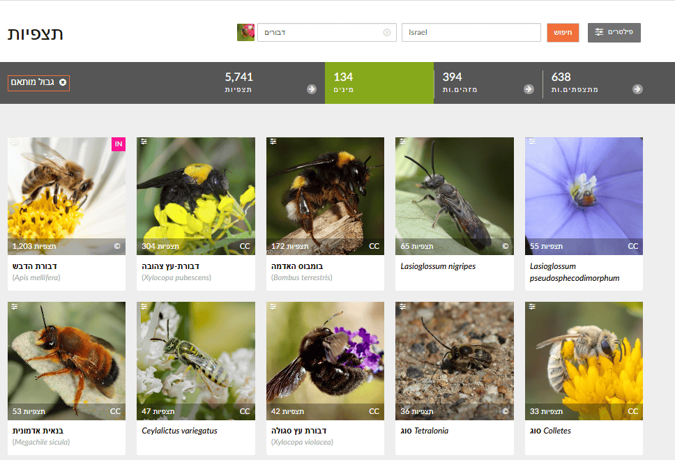
Which wild bee species are most common in our area?
❓ Why is this question important?
Wild bees are critical pollinators. Knowing the common species helps guide protection and habitat management. Tracking common species can reveal population trends, and familiarity with local bee diversity raises awareness of their importance. Israel has about 1,100 wild bee species (see selected field guides for focal groups).
⚖️ What biases and limitations may affect the investigation?
- ID bias: Wild bee identification is challenging and often requires expertise, increasing error risk.
- Detectability: Larger, colorful, or conspicuous species tend to be reported more.
- Human bias: Some observers specialize in bees; their activity concentrations can skew results.
- Geographic coverage: Some areas may have insufficient observations.
🔍 How and where can the data be found?
In Explore, set Filters to “Bees” (Anthophila) and choose a place (Israel or a city). Review the Species list in results. Lists are typically sorted by observation count, with the most common species first.
🧠 What to do with the data?
- Review the top species by number of observations; consider focusing on Research Grade records for higher reliability.
- Build a bar chart of the top 10–20 wild bee species by observation count.
- Compare to any available species lists for your area. Are common species missing? Are rare species reported often? Seek information in urban nature surveys, the “Wild Bees in Israel” Facebook group, the Ramat Hanadiv Wild Bee Monitoring project, etc.
Which birds are reported most in spring, and which in winter?
❓ Why is this question important?
This question supports understanding of migration—many birds migrate, and seasonal reporting can distinguish migrants from residents. It also reveals seasonal biodiversity, i.e., how bird assemblages differ across seasons—useful for beginner birders planning observations.
⚖️ What biases and limitations may affect the investigation?
- Human bias: Birding activity varies by season.
- Detectability: Birds are more vocal/active in breeding season (spring), increasing reports.
- ID bias: Mistakes among similar species; migrants vs residents.
- Migration timing: Migrants may appear only part of a season, affecting totals.
🔍 How and where can the data be found?
In Explore, set Filters to Birds (Aves) and choose a region. Filter by month/season (e.g., March–May for spring; December–February for winter). Review the Species list for each season.
🧠 What to do with the data?
- Build two separate lists—most common species in spring vs winter—and compare. Which appear in both (residents)? Only in spring (often summer migrants)? Only in winter (often winter migrants)?
- Compare total bird observations between seasons.
- Explain differences based on migration and habitat requirements.
How many observations of invasive plant species are there in a city?
❓ Why is this question important?
Invasive species threaten local biodiversity and ecosystems. Answering this gives a picture of invasive spread in an area and can help municipalities plan control and removal.
⚖️ What biases and limitations may affect the investigation?
- ID bias: Identifying invasive plants requires knowledge; errors are possible.
- Definition of “invasive”: Criteria vary by place; rely on an authoritative local list (e.g., the Israel Nature Risk Assessment Portal or the Ma’arag invasive plants list).
- Detectability: Conspicuous or aggressive invaders may be over-reported.
- Geographic coverage: High-spread areas might be under-reported where observers are scarce.
🔍 How and where can the data be found?
In Explore, check the “introduced / invasive” filter to return only invasive species observations. You can add other filters (plants, birds, etc.). Set a specific geographic area.
🧠 What to do with the data?
- Count total observations for selected groups, e.g., invasive plants in the city.
- Examine the map to see distribution—are there clusters?
- Identify the most frequently observed invasive species.
- If data span multiple years, check whether invasive observations are rising or falling over time.
- Discuss implications for local biodiversity and potential conservation actions.
Social–Behavioral Questions
Are there days of the week with more observations?
❓ Why is this question important?
This question can reveal user activity patterns—when people go outdoors and report (e.g., weekends)—and how these patterns affect sampling bias. It helps in planning events or “observation challenges” during high-activity times.
⚖️ What biases and limitations may affect the investigation?
- Human bias: Leisure patterns directly affect observation timing.
- Special events: BioBlitzes/challenges can spike counts on specific days.
- Seasonality: Some seasons (e.g., summer) may see higher activity throughout the week.
🔍 How and where can the data be found?
Choose a sample (e.g., all Israel observations in 2024). Export to Excel. Exported data include observation date; add day of week (prefer consulting a calendar rather than auto-fill, due to leap-year shifts).
🧠 What to do with the data?
- Using a spreadsheet or analysis software, count observations per weekday (Sun, Mon, etc.).
- Create a bar chart of total observations by weekday. Are weekends clearly higher?
- Discuss how people’s life/work patterns shape iNaturalist reporting.
What characterizes areas with the most observations—parks, private gardens, or sidewalks?
❓ Why is this question important?
This question can reveal user preferences and which habitats are favored by iNaturalist users. You can see where most information comes from, and where gaps exist—guiding where to encourage more reporting (e.g., under-reported areas).
⚖️ What biases and limitations may affect the investigation?
- Habitat classification: It’s hard to auto-assign observations to “park,” “private garden,” or “sidewalk” using iNaturalist alone; manual work or GIS layers are needed.
- Accessibility bias: Parks/sidewalks are more accessible than private gardens.
- Human bias: Personal preferences for certain environments.
🔍 How and where can the data be found?
Choose a sample (e.g., all observations in a given city in 2024). Export to Excel. Export includes coordinates. Use mapping software (e.g., QGIS or Google My Maps) to plot observations. For students with GIS experience, download layers for parks, public gardens, residential areas, and road networks (from the municipality or other sources)
🧠 What to do with the data?
- Manually classify each observation by habitat type (e.g., sidewalks, walls, fallow field, stream channel, public garden, community garden, etc.); display on a map with distinct icons/colors by category.
- Count observations per habitat type and compare among categories.
- Discuss results—what differences emerge? Any surprises? What conclusions can we draw about biodiversity and human activity across urban environments?
What is the ratio among observation quality grades?
❓ Why is this question important?
Understanding differences in observation quality—and the proportion of unidentified vs Research Grade—matters for overall data reliability. Identifying gaps in quality can guide actions to boost identification participation and evaluate the community’s contribution to verification.
⚖️ What biases and limitations may affect the investigation?
- Participant knowledge/accuracy: New users tend to upload less accurate or non-species-level IDs, reducing counts that reach Research Grade.
- Community ID gaps: Some taxa (e.g., tiny insects, fungi) receive fewer community IDs, leaving many at “Needs ID.”
- Geographic bias: Areas with few participants may see slower verification compared to big cities.
- Poor photos or partial info: Limit others’ ability to identify the species.
- Preference for “charismatic” taxa: Rare/striking species receive more IDs; common species may linger at lower status.
🔍 How and where can the data be found?
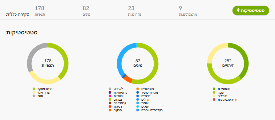
In iNaturalist you can filter by quality grade: Needs ID – not yet fully identified; Research Grade – ID agreed by at least two; Casual – missing basic requirements (no location/photo, etc.). For a project, its Stats page (figure below) shows a left-hand chart with the three quality levels; clicking each color opens the corresponding observation list.
Alternatively, in Explore set area/taxon/dates as desired. In Filters you can select verifiable, Research Grade, or Needs ID. To reach Casual, append &quality_grade=casual to the page URL (ensure “verifiable” is unchecked)
You can also export data as CSV for deeper analysis in Excel or Google Sheets.
🧠 What to do with the data?
- Compute the proportion of observations in each quality grade (see calculation below), by category.
- Compare between areas or taxonomic groups. For example: are bird observations identified to Research Grade more often than plants? Are IDs faster/more common in urban vs rural areas?
- Identify gaps/weak points (e.g., many Needs ID).
- Draft action items: encourage community IDs, train for better photos, focus activities on hard-to-ID groups, etc.
General Questions with Room to Expand
Which factors influence the distribution of a chosen species in space?
❓ Why is this question important?
This question supports understanding the ecology of a selected species—learning about environmental drivers (habitat, climate, food availability) that affect its presence. This is essential for planning conservation actions for protected or threatened species. It also reveals ecological interactions and whether presence correlates with other environmental factors. You can compare databases compiled from external sources and/or from students’ own observations.
⚖️ What biases and limitations may affect the investigation?
- Data gaps: There may be too few records for the chosen species to run a comprehensive analysis.
- Human bias: Observers may search for the species in particular areas.
- Missing variables: Many drivers (climate, soil, pollutants) are not available from iNaturalist alone.
- Correlation vs causation: Remember correlation does not imply causation.
🔍 How and where can the data be found?
Choose an interesting species with sufficient observations in the study area. Export all observations for that species to Excel (with coordinates, dates, photos) and upload them to a platform such as Google Maps or a GIS tool where you can add additional data layers. In parallel, collect data on environmental factors (land-cover map, climate, distance to water, vegetation map, etc.) from external sources (Central Bureau of Statistics, Water Authority, Google Maps…) or collect complementary field observations with students.
Below are potential drivers and how to collect them:
| Factor | Explanation | How students can collect / obtain data? |
| Temperature & humidity | Represent the effect of urban heat islands on species distribution | Use a thermometer/hygrometer or weather apps (e.g., Weather.com); compare shaded vs sunny areas; Ministry of Environmental Protection heat-island maps. |
| Artificial light | Night light affects insect, bird, and bat behavior | Evening observations in lit vs dark areas; measure light intensity (e.g., lux-meter app). |
| Water availability | Critical for drinking, breeding, or habitat | Survey water points in the neighborhood (fountains, puddles, irrigation, drainage); note animal presence nearby. |
| Vegetation | Provides food, shelter, nesting sites | Record plant types on streets/in gardens; photograph and upload to iNaturalist or PlantNet; map trees and shrubs. |
| Food availability | Influences birds, rodents, insects | Note potential food sources: open trash bins, food leftovers, fallen fruits, wild plants. |
| Interactions with other species | Competition, predation, mutualism affect presence | Document observations of species interacting (e.g., bee on flower); upload with time and location. |
| Mobility/dispersion | More mobile species reach more city areas | Repeated surveys tracking species presence across sites on the same day or over time. |
| Land use | Different environments attract different species (park, parking lot, building) | Map city land-use types via maps or field surveys; compare species seen in each type. |
| Green-space fragmentation | Movement barriers between green areas | Use Google maps or field checks to find safe passages; document connectivity or isolation among green patches. |
| Pollution | Harms health/survival of various species | Note pollution sources (noise, air, trash); record noise with apps; photograph open trash sources. |
| Urban maintenance | Spraying, cleaning, landscaping affect local species | Photograph before/after treatments; interview a municipal gardener; monitor frequently managed sites. |
🧠 What to do with the data?
- Map the species’ observations and add layers (forests, agriculture, water, elevation).
- Visual analysis: Are observations clustered in specific zones? Any visual link to environmental factors?
- Statistics (advanced): Run a logistic regression (e.g., in R/Python) to test relationships between species presence and environmental factors.
- Discuss hypotheses about drivers of distribution and how to validate them.
How does the presence of a particular plant affect local insect diversity?
❓ Why is this question important?
Plants provide habitat and food for insects. This question tests the relationship and allows assessment of ecosystem services—how a plant contributes to local biodiversity. For gardening plans, it helps identify plants to attract beneficial insects.
⚖️ What biases and limitations may affect the investigation?
- Human bias: Observers may report more where they see interesting plants/insects.
- Data precision: iNaturalist doesn’t automatically link a given insect observation to a nearby plant.
- System complexity: Ecological interactions are complex and influenced by many factors.
🔍 How and where can the data be found?
Pick a common plant in your area with many observations. Export all observations of the chosen plant (with coordinates). Export all insect observations for the same geographic area (ensure it’s large enough to include the plant’s range). Upload both layers to a GIS mapping platform. Use the tool to calculate distances and identify insect observations within a chosen proximity to plant observations.
🧠 What to do with the data?
- Spatial analysis: Map plant and insect observation locations.
- Define “zone of influence”: Set a radius around each plant observation (e.g., 10 m) and count how many insect species (or observations) fall within it. Because insect abundance is influenced by more than the focal plant, include controls—compare insect diversity near the plant vs areas without it (or with another plant) within the same habitat.
- Statistics (advanced): Test whether insect diversity differs significantly between areas with vs without the plant.
- Discuss potential interactions (pollination, predation, shelter).
Is there a correlation between distance to water and animal diversity?
❓ Why is this question important?
This question helps clarify ecological needs—water is critical for most animals. Answers can identify priority conservation areas if water sources act as biodiversity hotspots. It also informs how urban development near water affects wildlife.
⚖️ What biases and limitations may affect the investigation?
- Human bias: People tend to spend time and report near water (streams, lakes).
- Water-source data: You need a precise map of water sources.
- Other influences: Diversity is also shaped by vegetation cover, pollution, human disturbance, etc.
🔍 How and where can the data be found?
Choose an area with many water sources (e.g., Jerusalem Hills, Golan Heights). Export all animal observations (or a group like amphibians, reptiles, mammals) with coordinates.
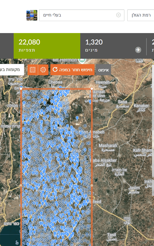
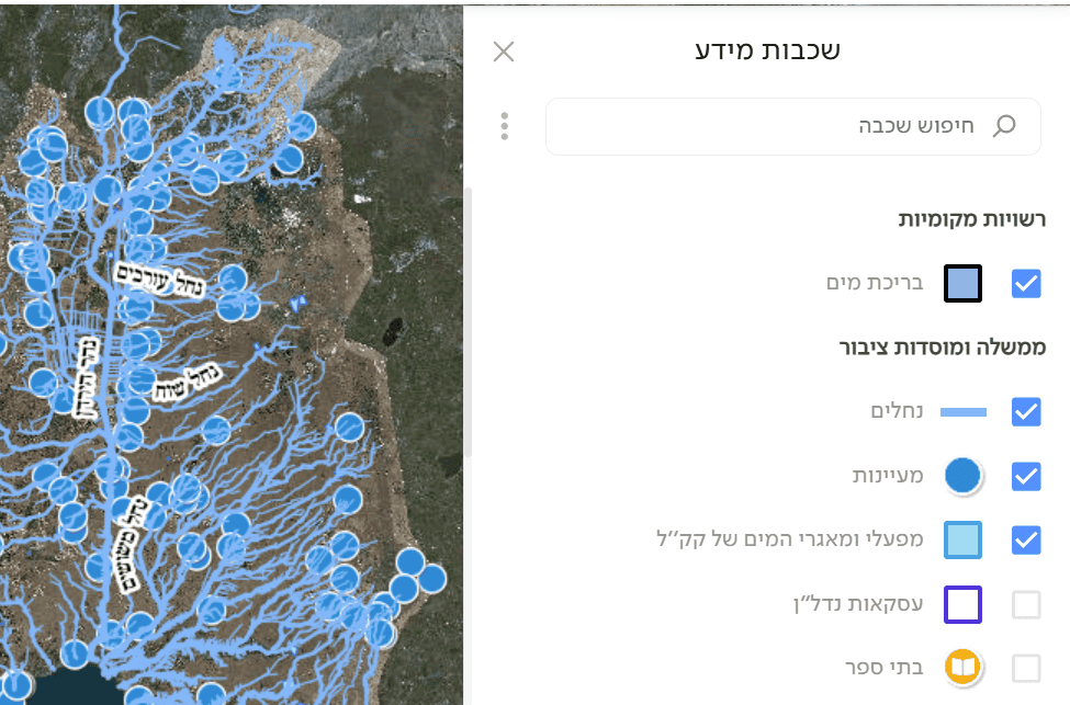
Upload the data to Google Maps or a GIS tool that supports additional layers. Add a digital map of water sources (streams, lakes, ponds) for the chosen region. For Israel, see GovMap—enable layers such as pools, springs, streams, and reservoirs (as in the figure), then save/download (under Applications). You can also use the Water Authority’s spring map. Upload the water-source layer and compute the distance from each animal observation to the nearest water source.
🧠 What to do with the data?
- Plot observations on the map along with water sources.
- Distance groups: Bin observations by distance to water (e.g., 0–100 m, 100–500 m, 500+ m).
- Diversity: For each distance bin, compute species richness.
- Scatter plot: Show species richness as a function of distance to water.
- Test: Is there a negative correlation (diversity declines with distance)?
Has urban species diversity changed over the last 5 years?
❓ Why is this question important?
It tracks environmental change. Shifts in biodiversity can indicate ecosystem health. You can test whether urban development, pollution, or climate change impacts biodiversity, or whether conservation/restoration is effective.
⚖️ What biases and limitations may affect the investigation?
- Sampling effort changes: If the number or activity of observers changed substantially between years, results may be misleading.
- Human bias: New or veteran observers influence which species are reported.
- Partial coverage: iNaturalist is not a full scientific survey; some changes may not be reflected. Treat observations as an opportunistic dataset, not systematic sampling.
🔍 How and where can the data be found?
Set the search area to city boundaries. If the city is not a defined iNaturalist Place, add it as a new Place. Filter by year range (from–to). Focus on Research Grade observations for higher reliability. Check the number of species and number of observations from the city for each of the last 5 years separately. Observation totals matter because an increase in species may be explained by more observations. For example, Tel Aviv 2020–2024:
| Year | Species count | Research Grade observations |
| 2020 | 354 | 906 |
| 2021 | 361 | 801 |
| 2022 | 644 | 1975 |
| 2023 | 653 | 2242 |
| 2024 | 892 | 3671 |
🧠 What to do with the data?
- For each year, count the unique Research Grade species (as in the table).
- Plot a trend graph over years, e.g.:
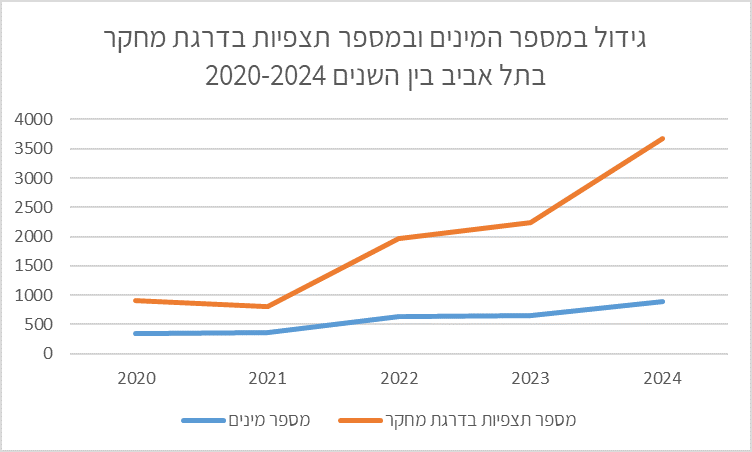
- Discuss: Is there a clear trend? Has diversity increased, decreased, or remained stable? Which factors could explain the findings? What are the implications for the city’s nature? The table and chart show a marked increase in observations year-to-year, alongside an increase in species. Species more than doubled by 2024 over five years. One may infer: more observations → more species detected. This occurred despite urban development converting open areas into built spaces (seek corroborating data from the municipality or Israel Planning Administration). Growth might also stem from expanded urban nature sites, restorations, etc. To assess this—request municipal data on open-space conservation and urban nature management.